Add a company logo to photos on iPhone: the built-in ways, and one logo for the whole crew
Updated · 3 min read
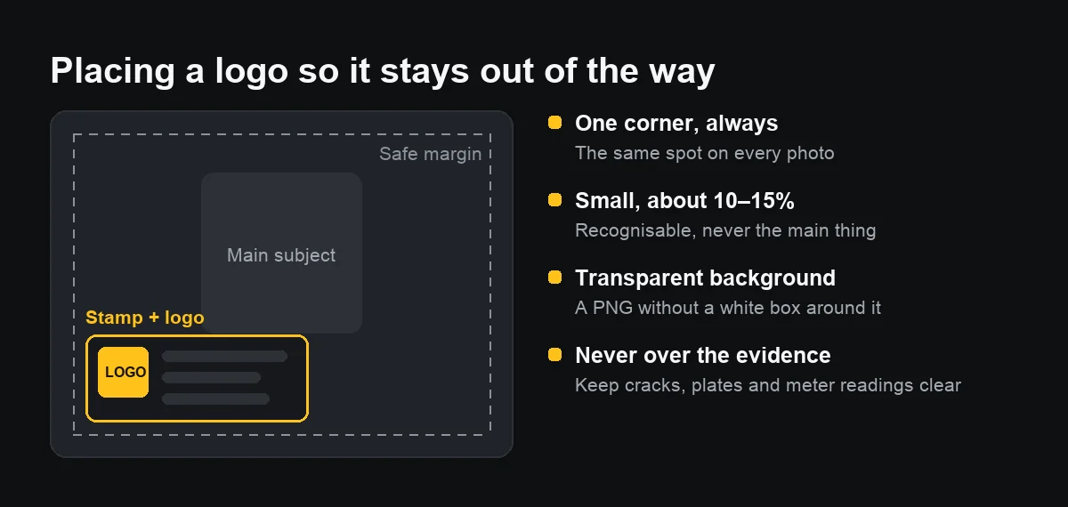
On iPhone, you can add a logo to one photo with Markup in the Photos app (as a sticker), or to many at once with the Overlay Image action in the Shortcuts app. The logo should be a PNG with a transparent background, about a tenth of the photo's width, always in the same corner and clear of the main subject.
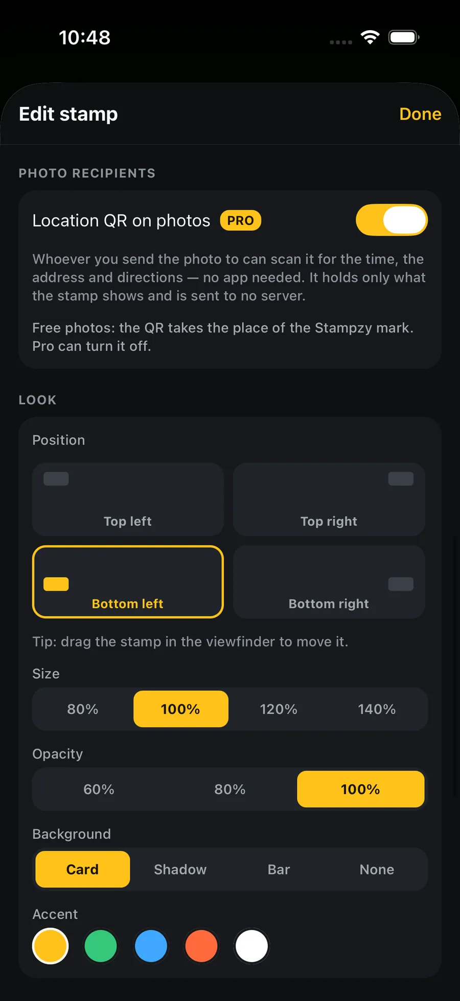
If a whole crew takes work photos every day, stamping the logo at capture is far easier than adding it photo by photo. This guide covers both.
How should I prepare the logo?
- A PNG with a transparent background. A logo on white shows up as a white box on the photo.
- A sensible size: 500 to 1,000 pixels wide is plenty for phone photos.
- A simple version that reads when small: drop the tagline, keep the mark and the name.
- Saved in Photos or Files so you can pick it quickly.
How do I add a logo to one photo with Markup?
Since iOS 17 you can turn the logo into a sticker and place it on a photo:
- Open the logo image in Photos, touch and hold the logo until it lifts off the background, and choose Add Sticker.
- Open the photo, tap Edit, tap the Markup button (the pen tip), tap + and choose Add Sticker.
- Pick your logo, drag it into a corner, pinch to resize, then tap Done.
Automatic lifting works best on logos with solid shapes; thin lettering may get clipped. Button names can vary slightly between iOS versions.
Can I add a logo to many photos at once?
Yes, with Apple's Shortcuts app. Build a shortcut that receives images from the share sheet, add the Overlay Image action with your logo, set its position and size once, then add Save to Photo Album. From then on, select photos in Photos, tap Share and run the shortcut.
The shortcut saves new copies and leaves the originals. Test it on a few photos first, because portrait and landscape photos put the logo in different places if you use fixed coordinates.
Where should the logo go?
- One corner, always the same one. Viewers get used to it, and photos in one report look consistent.
- Small, about 10 to 15% of the photo's width. Recognisable, never the main thing.
- Inset from the edge, so a square crop or a preview frame does not cut it.
- Never over what must be seen: a crack, a number plate, a meter reading, the face of the person checking in.
Does a logo stop people reusing my photos?
Only partly. A small corner logo is easy to crop out; a big central one ruins the photo. On work photos, a logo mainly tells the recipient whose photo it is, next to the site name and the time, rather than preventing copying. Nor does a logo turn a photo into evidence: it remains the photographer's own record.
When is it better to stamp the logo at capture?
When photos are taken every day, by several people, and go straight to a customer or a project owner. Adding a logo afterwards means everyone does it differently, someone forgets, someone sends the version without it. A logo in the stamp at capture makes every photo the same with no extra step for anyone.